Wednesday, 14 December 2011
Thursday, 1 December 2011
ISSUES BRIEF - MAKING OF
Our current project is to take Issue with something. I wanted to look at it from a sporting point of view, and looked into cheating in sport. Came across a boxing incident from 1983 in a fight between Billy Collins Jnr. and his opponent Luis Resto. There was tampering with Resto's gloves, and huge controversy exploded after the fight. The story goes on a lot further, miles, from there and I found it incredibly interesting. Anyway, here is the making of; 4 colour CMYK prints. Will explain the reasoning behind, when the final prints are posted!

Cyan done
Cyan and Magenta
Sunday, 20 November 2011
SUBVERT THE FAMILIAR
Saturday, 12 November 2011
Wednesday, 12 October 2011
Wednesday, 21 September 2011
UP TO NOW EXHIBITION WORK - SNEAK PREVIEW
Sunday, 4 September 2011
SUMMER PROJECT
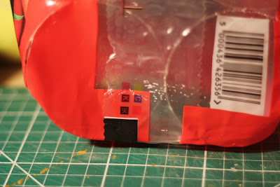
Been getting quite interested in Packaging design over summer, and for this reason I am going to base my summer project on this topic area. I have always been intrigued by the CYMK colour matching things on packaging. Although not part of the design, and normally out of the potential customers sight, there's something in my opinion quite interesting about them. These are going to be 'What I collect"

THE ENTENTE
These are screenshots from my 2 week placement at The Entente. The Entente are 2 Brighton Graphic Design graduates who run their own studio. Both quality guys, and shit hot at what they do!
The first thing I worked on with them is what you can see below. The brief was to brand a client of theirs who they had been doing work for for years. Give him a mark, a website, and an overall identity. The client runs life drawing sessions and was to work under the title 'The Draw'. I started to work on the mark and began with more obvious approaches which then led onto more abstract and stronger ideas.

WILMSLOW WIZARDS
Wednesday, 22 June 2011
PERSONAL PROJECT - BREAKDOWN OF A JUMPSHOT
For my personal project i was looking at the technique of a jumpshot. In particular what the muscles in the body are doing. I wanted to use video and motion graphics as my medium, as I have never used anything like this before. The piece is very unfinished (no sound and incomplete) as I ran out of time! After effects is horrible!
Tuesday, 7 June 2011
Sunday, 15 May 2011
Monday, 2 May 2011
Friday, 25 March 2011
FEDRIGONI - THE FINAL
This is my, Matt Dreyer's and Mia Warner's entry for the YCN Fedrigoni brief.
The idea behind the video was that the diamond shape (crafted from Fedrigoni's Pergemenata paper range) was symbolic for the types of companies Fedrigoni supply its paper to.
The use of projectors brings paper into the 'digital age', this being something Fedrigoni wanted covering in the brief.
However, it is still individual pieces of paper which shows the material in its simplest form. Bar cutting each strip to the right size, there has been no other tinkering such as folding, bending, twisting.
Just paper.
Subscribe to:
Comments (Atom)


